|
I still cheer every time I see a logo successfully chip away at the tenets of traditional logo design. This trend is one such rebel. It stands up and proclaims, “To hell with vectored edges!” This group is beautifully crafted. The shape is formed, but then a 5,000-watt krypton bulb blows out the mark’s critical edges. The nerve to build an implied aura in a flat world is rewarded when the design calls for it. Melbourne's FutureBrand Australia could have captured a continent with a bounding kangaroo and sun, but they sealed the deal for adventurers and sun worshippers worldwide by welding a solar flare right into the viewers mind. [page_break] cmyk  |  | Wolken communica, Bellevue Art Museum | Cato Purnell Partners, Infratil |  | 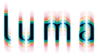 | Braue; Branding & Corporate Design, Druckhaus Wüst | Chase Design Group, First Light |
For years, cyan, magenta, yellow and black have been designer-speak in developing identities for printing and color houses. So when did these primary colors of the print world enter the vocabulary of the real world? When digital printers became cheaper than the inks you load in them. CMYK soon became the building blocks of a visually literate society. These base colors, spurned as long-time restrictions by designers, suddenly became the novel darlings of consumers. To explain a concept, knock it down to its basic elements: Suddenly, CMYK is a fresh tool that a savvy public understands.
flames  |  | Davidson Design, Target | Fernandez Design, Global Chaos |  |  | Luce Beaulieu, Le Poulet Grillé | Modern Dog Communications,
Experience Music Project |
|
|
| 出处:本站原创 作者:佚名 |
|
|

